Using inkPEEK
Why Your Tattoo Preview Looks Inked, Not Stickered
Nine out of ten tattoo mockups read as fake at a glance — and once that happens, you can't judge size or placement seriously anymore. This guide explains how inkPEEK avoids the sticker look, what the editor's Blend feature actually does, and how to drive it — including an interactive copy of the A·B·C·D slider and the settings we arrived at after testing it hundreds of times while building the tool.
Published August 5, 2026
Try it live: the A·B·C·D handles
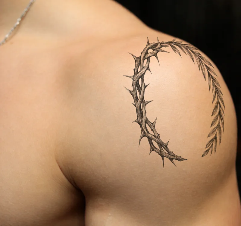
This is a working copy of the editor's slider, wired to a real inkPEEK shoulder preview — the photo recomputes live with the exact rule the editor applies. The track is the skin's brightness from darkest to brightest; the orange strip shows how visible the ink is at each brightness. Drag C to the left and watch the ink melt off the sheen— and read on below for why this makes previews look real:
Blend
Underlying layer — drag the handles, the photo reacts
Resulting ink visibility on that skin
Shadow fade start
Skin darker than this luminance hides the ink completely. At the default of 0, nothing is ever hidden in shadow.
Shadow fade end
From here up, ink is at full strength. The A→B span is a soft ramp, not a hard cut — the wider it is, the gentler the transition.
Highlight fade start
Skin brighter than this starts to win over the ink. Drag C left and more of the design thins out — useful on glossy, high-sheen photos.
Highlight fade end
At this brightness and above, the skin’s sheen fully covers the ink. Keep a wide C→D gap for a soft, believable falloff.
Maker's note: why A and B default to 0
That's not an oversight — it's a deliberate default. While building inkPEEK we tested shadow fading extensively, and even a small amount made the ink look like it was punching throughdark areas — instantly fake. Real ink doesn't vanish in shadow; it simply darkens with the skin.
Highlight fading (C·D) is different: it matches what real ink does under sheen, so it reads as natural. That's why Auto Apply only computes C and D and leaves A·B at 0. Our recommendation: leave A·B alone, and let Auto Apply drive C·D.
Why most tattoo mockups look fake
One cause: the design is pasted flat on top of the photo. A sticker-style composite ignores three things at once:
- The body's curves — your arm is a cylinder; the pasted design stays a flat rectangle.
- The skin's light — the photo has highlights and shadows, but the pasted design is equally bright everywhere.
- What ink is — a real tattoo lives in the skin, not on it.
The first problem is solved by inkPEEK's depth-aware wrapping. This guide is about the second and third — the light.
Real ink lives in the skin
Look closely at any healed tattoo in person:
- Where light hits directly and the skin sheens, the ink colors thin out and the skin's gloss rises over them.
- In shadow, the ink darkens together with the skin — it never disappears.
- In other words, ink doesn't ignore the lighting — it follows the skin's light exactly.
That's the tell that betrays sticker composites: skin that glistens with a razor-sharp, uniformly vivid design sitting on top of it. Your brain flags the mismatch instantly — “that's a separate layer.”
Blend If — a pro retouching trick, automated
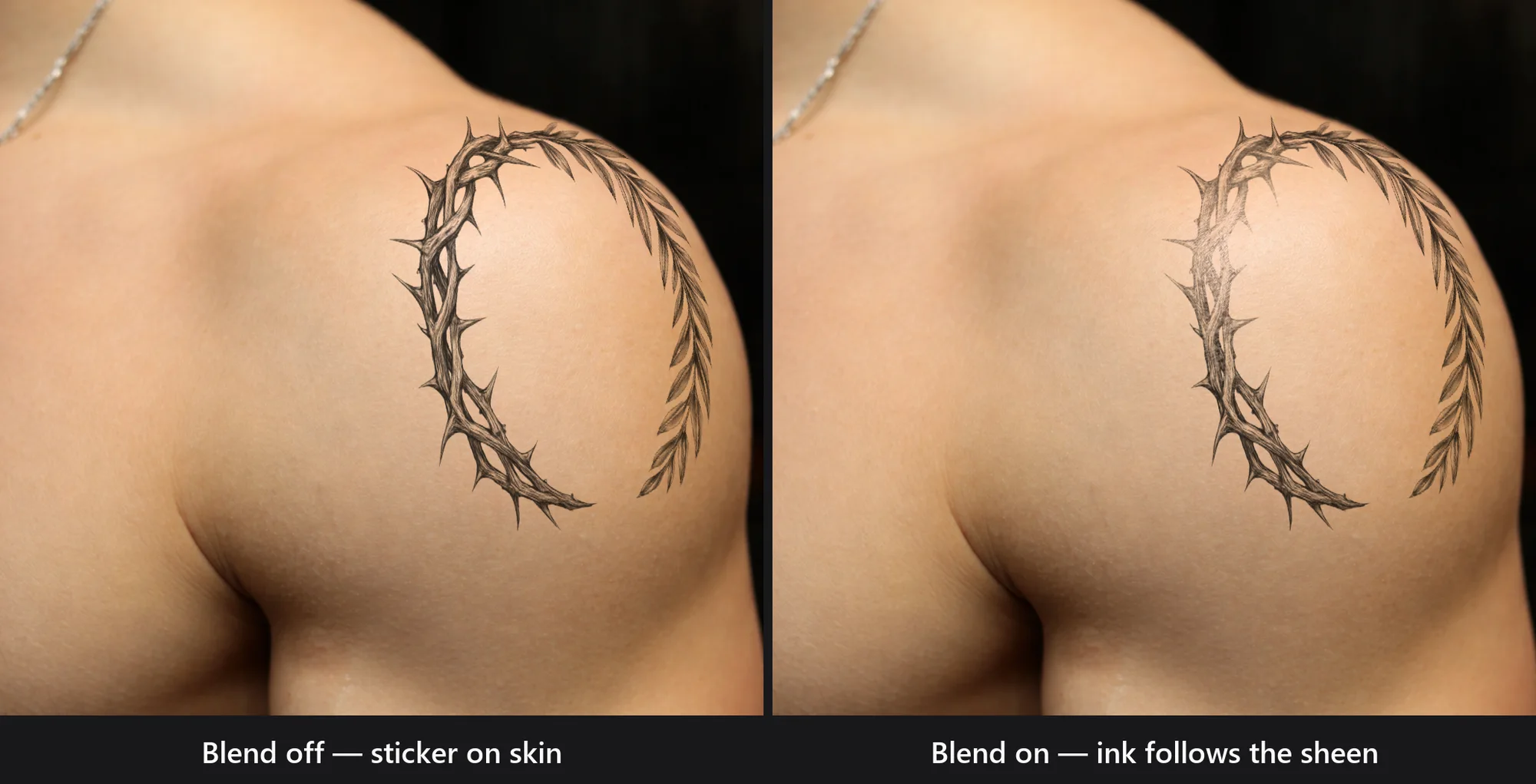
Photoshop has a feature professional retouchers use for exactly this: Blend If. The rule it implements is simple — “let the underlying layer's brightness control the top layer's opacity.” It's the industry-standard way to make a tattoo mockup look real, but tuning its sliders by eye takes practice.
inkPEEK builds the technique into the editor and computes it per photo:
- Using AI skin detection, it analyzes the brightness distribution of your skin under the design.
- Only the brightest ~10% of that skin — where light genuinely sheens — gets a soft ink fade.
- Because it's anchored to your photo's distribution rather than absolute values, it adapts to any exposure and any skin tone.
Combined with the default 80% ink opacity, this is what moves the design from “sticker on skin” to “ink in skin.”
Using it in the editor
- 1
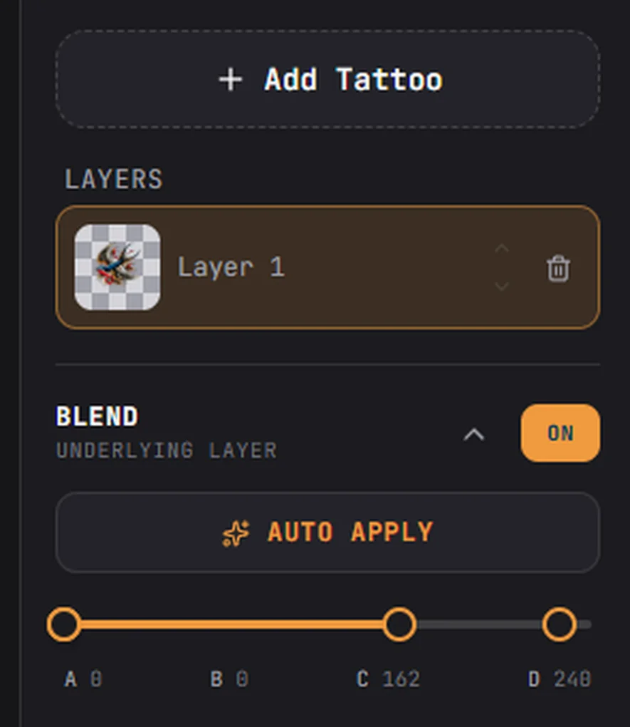
Blend toggle (On / Off)
Turns the luminance blending on. Flip it off and on once — the difference tells you everything this guide is about.
- 2
Auto Apply
Runs the per-photo computation described above. For most previews this one button is all you need. Moved or resized the design? Press it again — the skin underneath has changed.
- 3
The A·B·C·D slider
Manual fine-tuning, for when you want to drive it yourself — try them yourself in the live demo at the top of this guide.
Getting the best result
Photos where it shines
Soft directional light — like a window — gives skin a gentle sheen, and that’s exactly what the blend feeds on. The clearer the light and shadow, the more convincing the result.
Photos where it’s subtle
Direct flash or perfectly even lighting leaves little contrast to work with, so the effect looks minor. That’s fine — there’s nothing for the blend to fix.
Overdo it and you get a ghost
Drag C too far left and half the design melts away — which reads as fake in the opposite direction. “Natural on a second look” is the target, and Auto Apply usually lands right there.
Send screenshots with blend on
When you share a preview with your artist, keep the blend enabled — it’s the closest picture of how the real ink will sit in your skin.
Sharing the result with your artist? Here's exactly what to send.
Frequently asked questions
Can I just leave the blend off?
For judging position and size only, sure. But when you’re deciding how the tattoo will actually feel on your skin, turn it on — real ink always responds to the skin’s light and shadow, so the blended preview is the honest one.
I pressed Auto Apply and barely see a difference.
Flat, even lighting gives the blend little to work with — that’s normal, not a bug. Try a photo taken in directional light (near a window works well) and the difference becomes obvious.
Does this work on bold color tattoos too?
Yes. The blend reacts to your skin’s brightness, not the design’s colors — blackwork and full-color old school pieces both settle into the skin by the same rule.
See the difference on your own skin
Upload a design, press Auto Apply once, and compare sticker versus ink with your own eyes.
Try inkPEEK free